Week 6

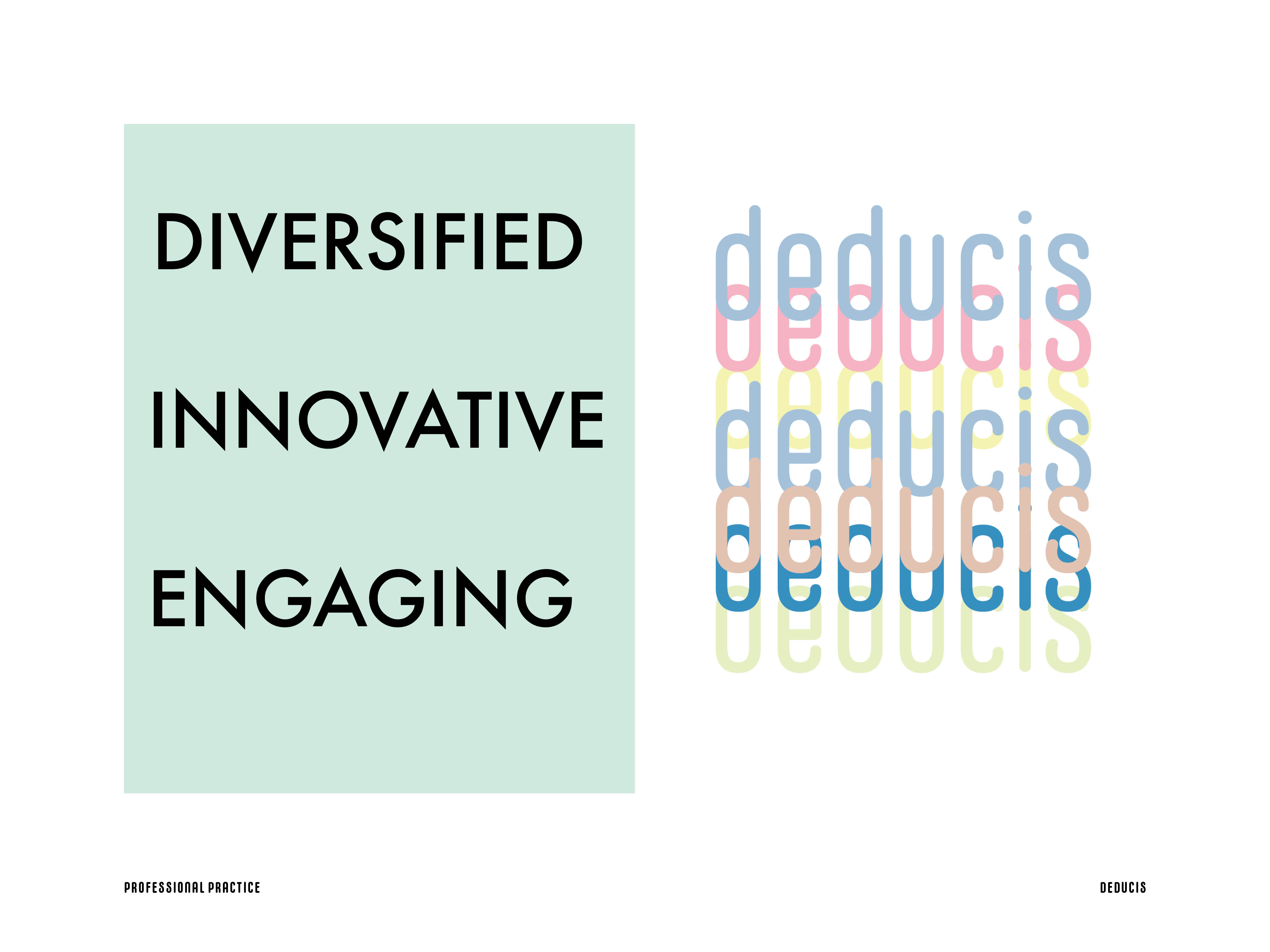
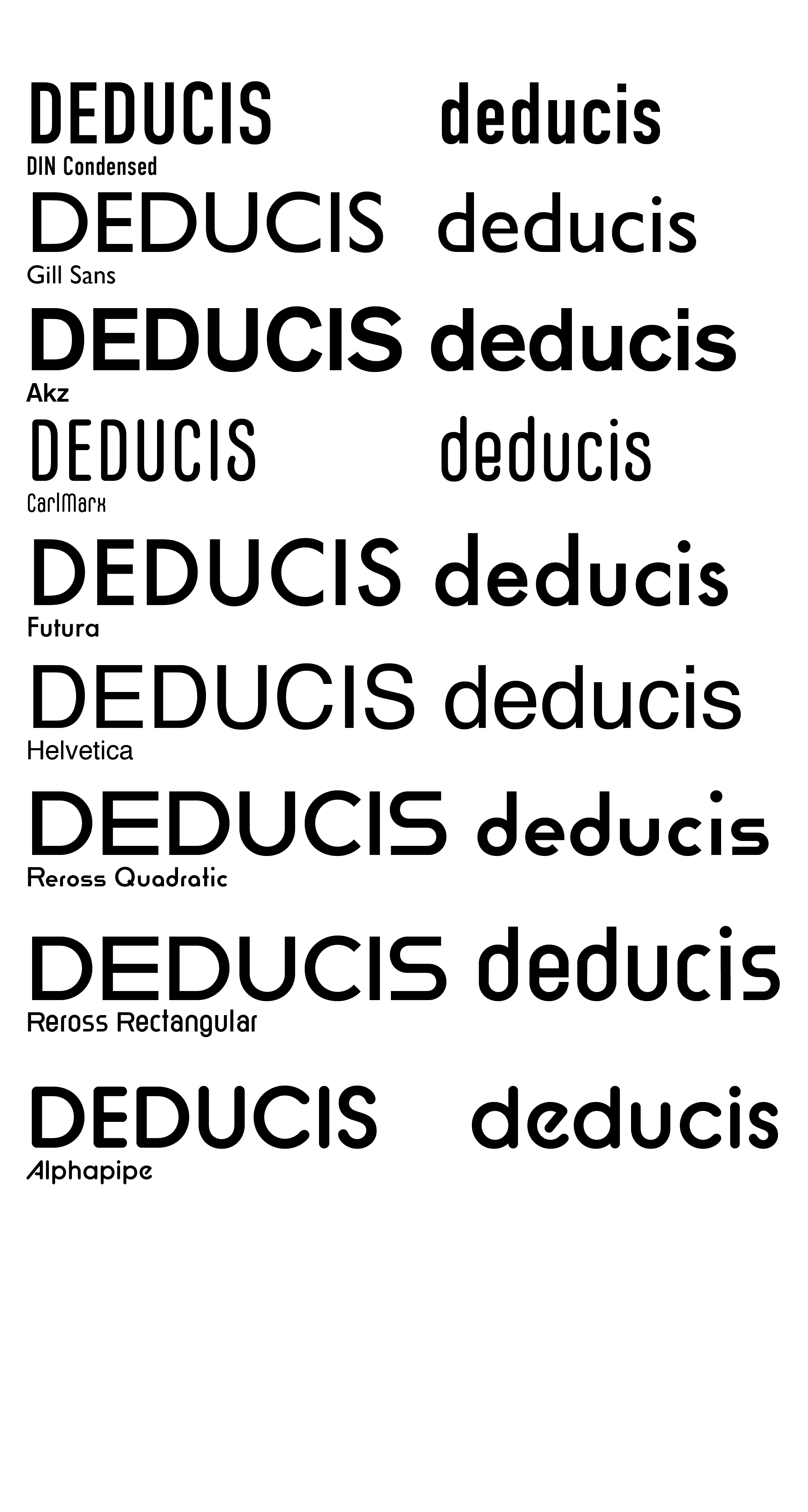
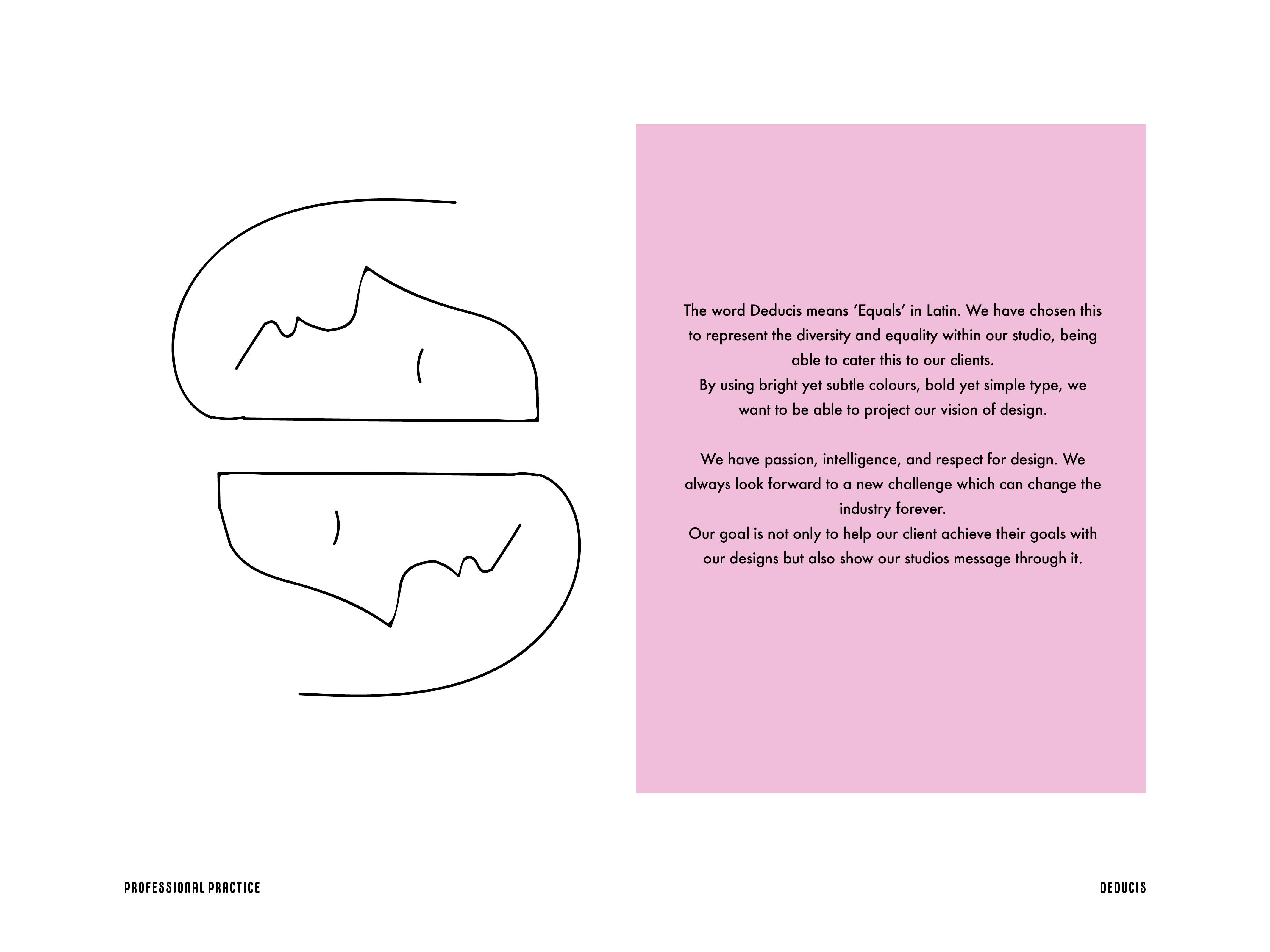
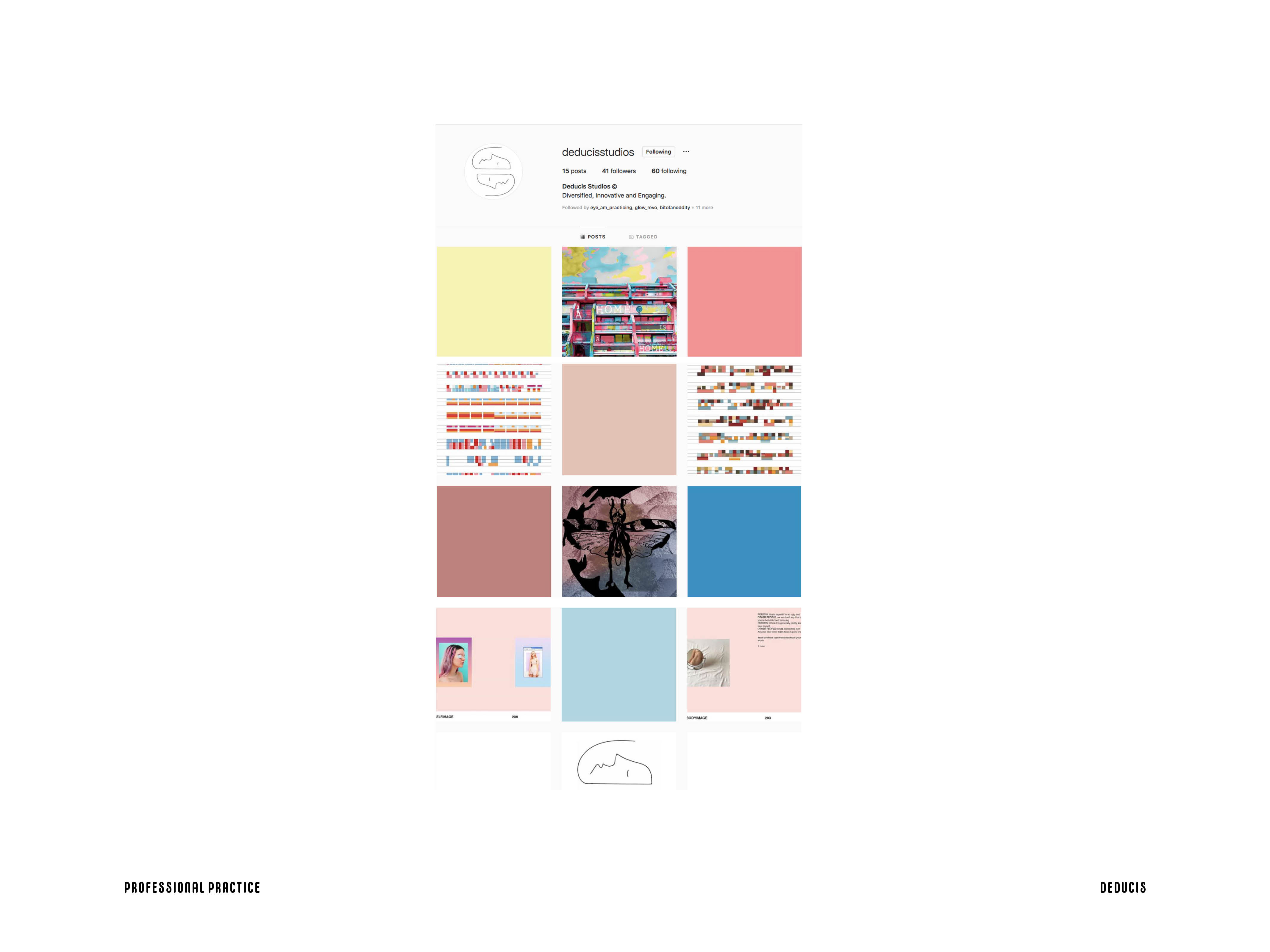
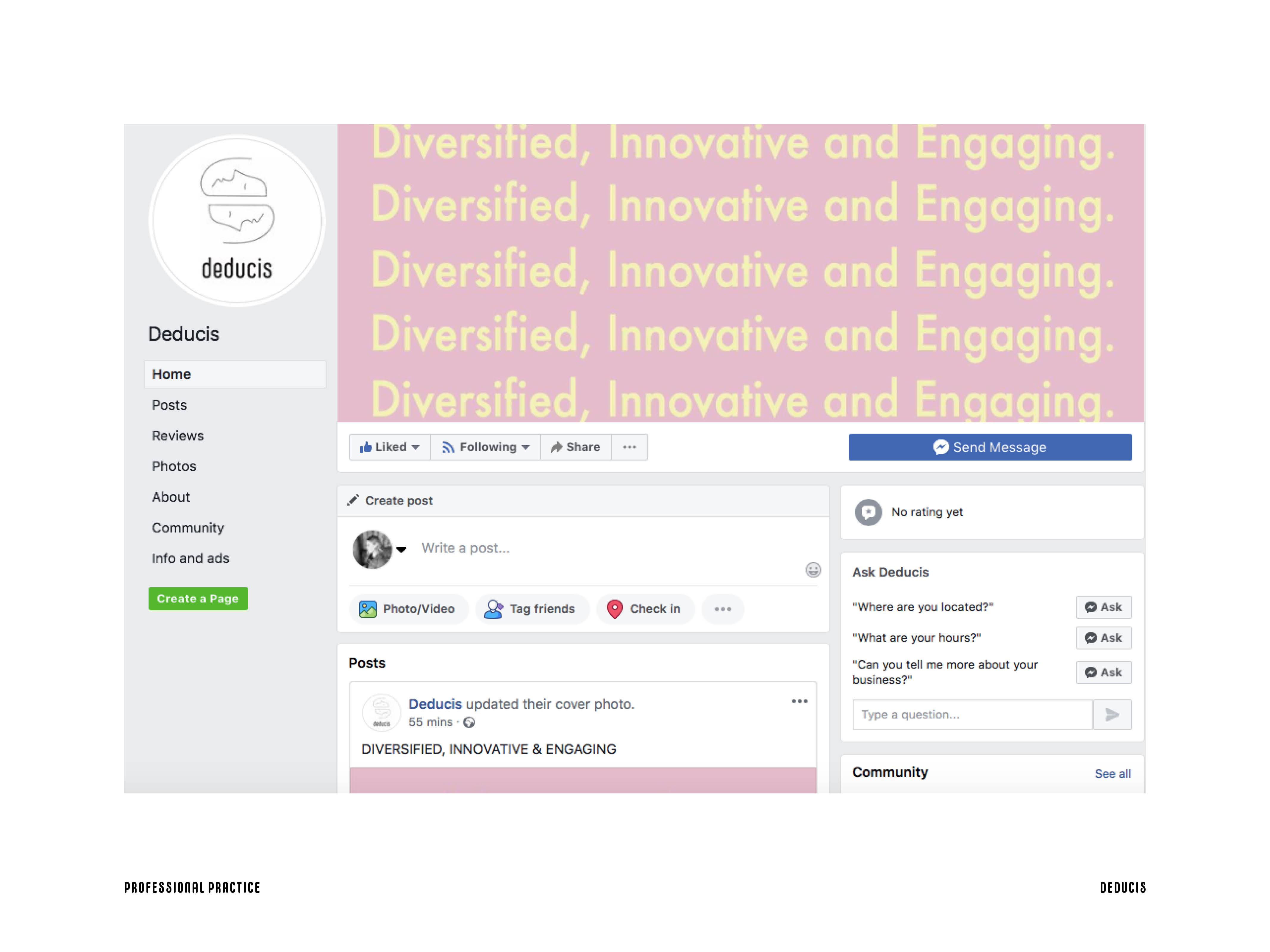
Deciding on a logo took a while for our team as we felt that we needed to get it just right with our principals and identity using such strong concepts as equality, being engaging and always remaining diversified.

The idea is two people who are different (therefore not facing each other and metaphorically suggests not seeing always eye to eye) but yet they still remain equal on in terms of self expression and having the same basic rights and privileges in our society.

Sidenote: Before coming up with the final logo we initially created one that combined an element from each of our studios designer that they thought best represented them in a simple manner. However, the designs did not really work well together just like everyones faces photoshopped together would not look natural. Therefore, we created the more uniform and forward version.

Week 5

I started creating my own personal website on Adobe Portfolio. Also started thinking about business cards and stationery that could go with it.

I decided to go for a minimalistic and simple look to draw focus on my illustrations and use of negative space. Typefaces I believe most suit my design work are also straightforward yet bold and all together it makes quite a maximalistic composition in the end- but that is how I would portray myself at a designer at this stage as well!

My website domain I settled on is: https://carolynisudesign.myportfolio.com

Week 4

This was a defining week for finally coming up with our studios identity and motto. We were experiencing a lot of trial and error when it came to phrasing our thoughts and principals in a neutral and straightforward way so that our clients could easily understand what we stand for and what kind of work we would like to be doing and are good at doing.

Additionally, we decided on who is best for which position and tasks and as someone who naturally takes charge I agreed to be the art director, creating and curating most of the content and making sure we are on track and everything gets done on time and at its best quality.

Notes:

  • Logo; introduction animation/gif thing; (Caroly, Glenn)
  • Aesthetics; (Caroly, Monika)
  • Website; (Meena; everyone)
  • Documentation; (Glenn)
  • Type selection; (Monika)
  • Identifying target group/clients and our message/identity; (Dobra)

Instagram posts -> everyone needs to find a piece of work that fits the overall aesthetic and is okay with posting it on the studio ig; (Meena)

Week 3

As Art Director I compiled all the information my group gave me during this week into moodboards for our stusios aesthetic. Below are screenshots and anwsers from my peers and then the moodboards I created trying to achieve something that looks simple yet modern and powerful with lots of use of colour and illustration combinations. I also made the following little plan for us to more forward since we were falling behind as the last group fully formed.

Things we need to do:

  • Website;
  • Booking and setting up dates for the open day thing; end of april, beginning of may
  • Planning more instagram posts;
  • Photos of each of you for animation piece
  • Promotional posters, flyers etc marketing

Week 1

What we did? As it was the first week of lessons, we were intorduced to the assignments we would have during this module and assigned to design groups which would later evolve into design studios.My group was mostly absent at that point but my group mate Monika and I were brainstorming for what our studios aesthetics could evolve into by firsthand exploring other studios we like and refining the definitons of our own personal design styles. Below are added some of the studios I introduced to Monika that I thought reflected what our studios potential aesthetics could resemble.
Visual Outcomes: